Just down the road, creeks starting to open up, sure sign spring is around the corner!
Here my set up...

...and with workshops coming up this summer, and some webinars I'm putting together for online art instruction, my secondary purpose is to gather photo references for lessons, and this day...I decided to demonstrate one of Edgar Payne's limited palette strategies using a dark neutral as a mother color, pulled into each color. Such imbues a natural working harmony, gives one nice control allowing you easily enough to slip into the gut hunch zone...and is one of about a half-dozen palette strategies I use and teach.

Here you see my darker neutral I mixed up, circled in red...and an arrow indicates I've added a bit of that neutral to each of these colors/values mixed.
What you see next, I've toned my linen support, wiped a bit of tone off to lighten values and indicate my subject layout intentions. Over that, I've mixed a darker reddish/orange with turps and my medium, and have drawn various masses. I am envisioning a rule of thirds grid in my mind's eye with intent for one bright near snow mass to fall on the lower right quandrant.
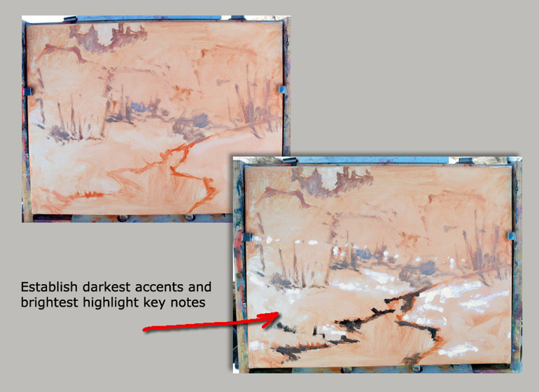
Then...the overlay shows I have painted and indicated the darkest accents and brightest...for really two reasons 1) in the event the light should change, I've nailed those indicators vital to the initial impulse of what caught my attention on this location, and 2) I have set parameters now committing that no other marks henceforth shall be as dark, nor as light/white...
Though I'm not sure about the light I had left to shoot the finished effort, I believe I have adjusted the image to be fairly accurate. I may re-shoot the work tomorrow under more ideal lighting...but, as said...pretty good...
9"x 12" linen...Early Running Creek....

...and as always, images can be clicked on to see larger image...


5 comments:
Great colors and tones!
Very nice Larry as usual but that such a obvious Fraze. I like the explanation a lot although isn't it much easier to give the whole canvas/panel a dark muddy wash and then lighten the light areas with a cloth, like David Curtis does for example? An other thing, I noticed that much (especially British artist) do paint with their palette inside direct sunlight, even Richard schmid talks about it and paint sometime that way. I tried this a little lately and knowing you'r more a contre joure guy, how are you thinking about letting the sunlight onto your palette? I've noticed that in some cases it even helps me to put more light into my paintings, how surprising is that???
Looking forward to hear your thoughts about that.
This is lovely... just the sort of effects and colors that make winter a joy to endure. The blues behind the reds are especially captivating. I hope you didn't freeze while painting this beauty.
Hey Rene...well, actually as you no doubt know, I approach each painting differently...equipped with a number of strategies, but as the gut hunch prescribes. That is...unless I'm testing out a theory as an instructor. Then I'm in it to learn what I may. A painting posted previous to this one used a wiping out approach, which I've oft used...as you suggest David to do- http://larryseiler.blogspot.com/2011/02/starting-new-one-long-slide-falls28x-22.html
As for the direct sunlight, I guess it depends on the angle. In winter...its a bit lower on the horizon, and sure I'll allow that if say I want my painting itself more in shadow. Yesterday I painted with my box sitting on the tailgate, and turning the box a certain way made it easier on my eyes to see the painting, but left the palette more exposed to the sun. I myself don't like the sunlight shining on the painting, to me...that is the more critical thing, because the sun will wash out the intensity of what you are doing making it a totally different thing once its back home indoors.
I figure if the painting looks good shaded...it will be stronger indoors.
By the same token...I think the sun could overly warm up your read on color. One reason Paul Strisik said he painted on a wood palette was that it was warmer. Pigment against a white palette would straight away appear warmer by comparison, but a wood palette forces you to mix the color warmer and there is less adjustment up on the painting later to tweak or pick up chroma strength.
The sun on the palette...I would think, tends to be more like mixing against a white palette, because the sun warms everything up you might presume a color warmer and more acceptable than perhaps it should be. In the shade...you'll push the warms more I would think. Not sure why the result as you would say would be putting more light into it...but that's an interesting thing to chew on. Perhaps the sun would tend to wash out some of the values, so you might in response mix your darks darker, and this would account for the appearance of more light on your painting? What do you think...and sorry getting to this so late..
thanks Diana...no, the cold has not been an issue. Twenty to thirty degrees feels like a heat wave. I've painted as cold as a minus 13 degrees...and THAT's cold!
Post a Comment