I've worked on the idea of lures for sometime now. I've been fascinated with the moment of euphoria, men and women as sportsmen engaging the outdoors, their spirit lifted up, refreshed...filled with anticipation and joy. A whole other area of "Sporting Portraits" was born out of that...which is a whole other area of my artistic life that I share with sportsmen one on one...give them a card with a special online site for them to check out...
but...of that, is the lore..
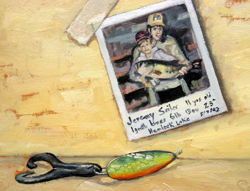
My younger son now 29 years of age...caught a monster trophy largemouth bass when he was quite young. It was quite a story, and an outdoor television program listed/featured his catch, and we had the bass mounted, kept the lure...and one old polaroid photograph. I decided to set them on my art table...and did a simple painting, a study...of the photo, what was written on it, the lure...etc.,

you can click on the images to see them slightly larger...
thing is, I was already trying to break up the background in this painting, done just a few years ago now. Getting more and more dissatisfied with flawless fill...and you see I've allowed the undertone to come thru to create more interest...
In this "incidental" done sometime in 2006...you see my use of brushwork, hints of color again aiming to create more variation in the background, though the spinner is the focal interest, attempting to diminish edges here and there.

Its funny now that I see it, but many of what I called "incidentals" that is...studies done aside with the idea that they should not define who I was ultimately as an artist...were done with an aim to more and more loosen up, become proficient, efficient, make quicker decisions all the hope to give me greater empowerment outdoors where sunlight comes in a smaller window of opportunity.
I actually thought at the time that this next one was more suggestively painted as an illusion of realism, well...when you compare to my old realistic rendering and laboring, sure...

I was so proud of the smudging of paint that suggested the Boy Scout logo...but still, look at the refinement of the topographical map and the finishing of this small painting top to bottom and side to side...
As fine as I thought this one was, I yet have it...meaning to my thinking it did not capture the mind or interest of viewers enough to buy it.
I mean...selling isn't everything, and my wife probably wishes that I had more interest toward that end actually or at least was more business savvy so-to-speak, but when you think you've done something well and sometimes doesn't sell, you think perhaps you missed the mark of what appeals and catches the eye.
I don't get discouraged by such...but am encouraged then to push, experiment some more.
We live afterall in an image bombarded world, and the eye is attuned to the necessity of wading thru all those images by tuning out, and doing so quite effectively. Part of the painting game is to reflect and develop strategies in our design and composing that would cause a work in this age to command attention and interest. One more thing that makes painting so alluring for me is this undaunting task...
As for the latest lure I'm doing...(the Jack Cobb posted below) not yet satisfied with the background...the lure in actuality is resting on grain of wood. I know without a doubt I can painstakingly represent that wood...
Here...a simple duck call with lovely wood grain...and as an incidental a suggestive effort to so paint the wood.

Thing is, the wood grain, is not the focal point nor interest...and the concept I'm attempting at the moment is how to use negative space as a comparitive note that directs the eye to the lure.
As an empty space...the lure being all there is, naturally the eye goes there...

but...like symmetry for aligning visual balance, the solution is too obvious, and thus visually "trite"...
The work then...in an image bombarded age lacks real compulsion and power to catch and hold the eye.
It is no longer how realistic an object can be rendered in my opinion that will carry promise to this end...but variation and intrigue, even paradox...
If you consider some of the works of Lipking of late, or Quang Ho...Schmid, you ask yourself, how can an image appear so contemporary, carry so many apparent abstract indicators and yet infuse the essentials of that which is realistic? I say "apparent" because all work is abstract in nature IMO...for good works must have good design which is abstract in nature, but these artists do not labor to diminish and eliminate traces of this abstract presence but actually glory in it...while teasing the eye.

Consider this marvelous work of Richard Schmid's "Adele" ...quite simple...but the unfinished collar, neckline and shoulder only suggested are quite abstract. The undertone or ground allowed to come thru, the smuding and diminished edges compel our eye while leaving us this wonderful sense of the portrait. If you are unfamiliar with Richard Schmid, considered one of our finest living modern masters do check him out!
Or check out this one "Frank's Kitchen" by Quang Ho, or his still life, "Fish on Dish"
Jeremy Lipkin is another...and these artist links are along my side categories listed here in the blog.
These artists are capable of the highest complete refinements...but then, why the tease? Would some say simply too lazy to finish the work???
I would invite you if you have not already, read thru my post below dated, December 28th...my comparison of this approach, the variation...the contrast and compare to that of the women's fashion of the day in the 1920's...
We all come to some inner revelation as to what works and why, and the ladie's fur wrap ought not be inferred to the thinking of the fine artists I have just mentioned. It is my own twisted kind of thinking I'm sure...but is helping to answer my self-arguments.
At any rate...if you scroll down...you'll see the lure, "Creeper" that is vertical...the painting of my granddaughter Ava Dawn..and others, where more and more I am stretching to develop this capability....


3 comments:
Larry, Great job on the lure series. I really enjoyed this post! Thank you for sharing your thoughts. I too still struggle with the background or "negative space". Trying to work it out too!
appreciate the time, thanks...Lori...they're fun
Hi Larry,
Jst wondering how you like paitning on linen. Also was wondering if you use lead primer on the linen like Richard Schmid does? Is there any alternatives besides the lead primer other than gesso?
~Kirby
Post a Comment