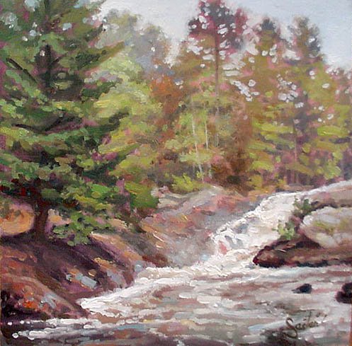
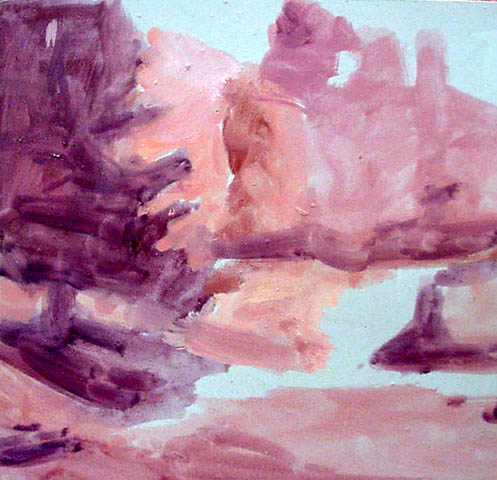
6"x 6" oil
One more experiment with Gruppe's suggestion
of reds as an undertone to support good greens
of nature. This time being an overcast day, so I
wanted to see if the reds making sunny greens
feel brighter could also produce somber moods.
I leaned the reds in the undertone a bit more
toward the cool side or reddish purples, which
you can see in the smaller image of the undertone
stage I added here.
I think it worked out rather well....


2 comments:
I love your landscapes and still lifes. Thank you for sharing.
appreciate it Annie, thanks.. !
Post a Comment